My Blog.
Inspired Artist: Paul Saari
|
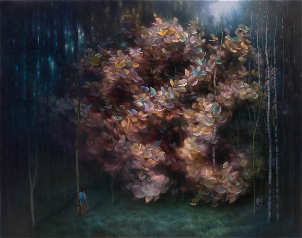
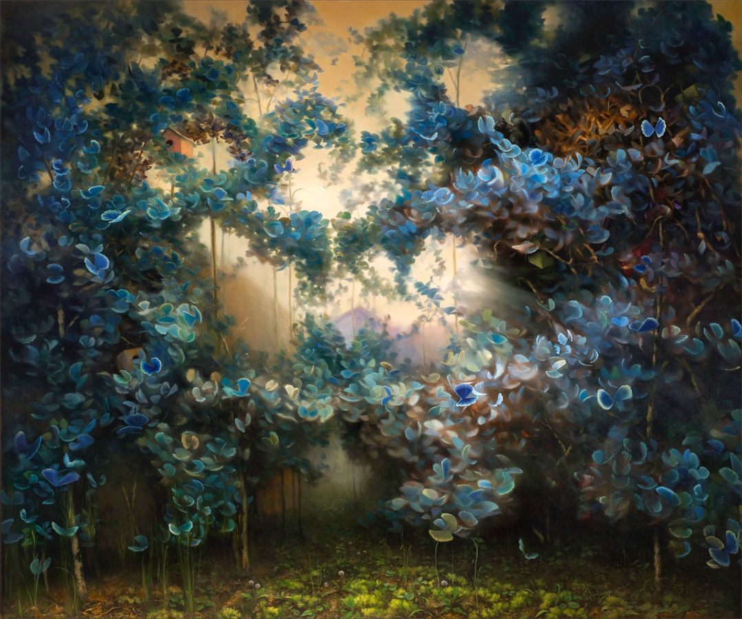
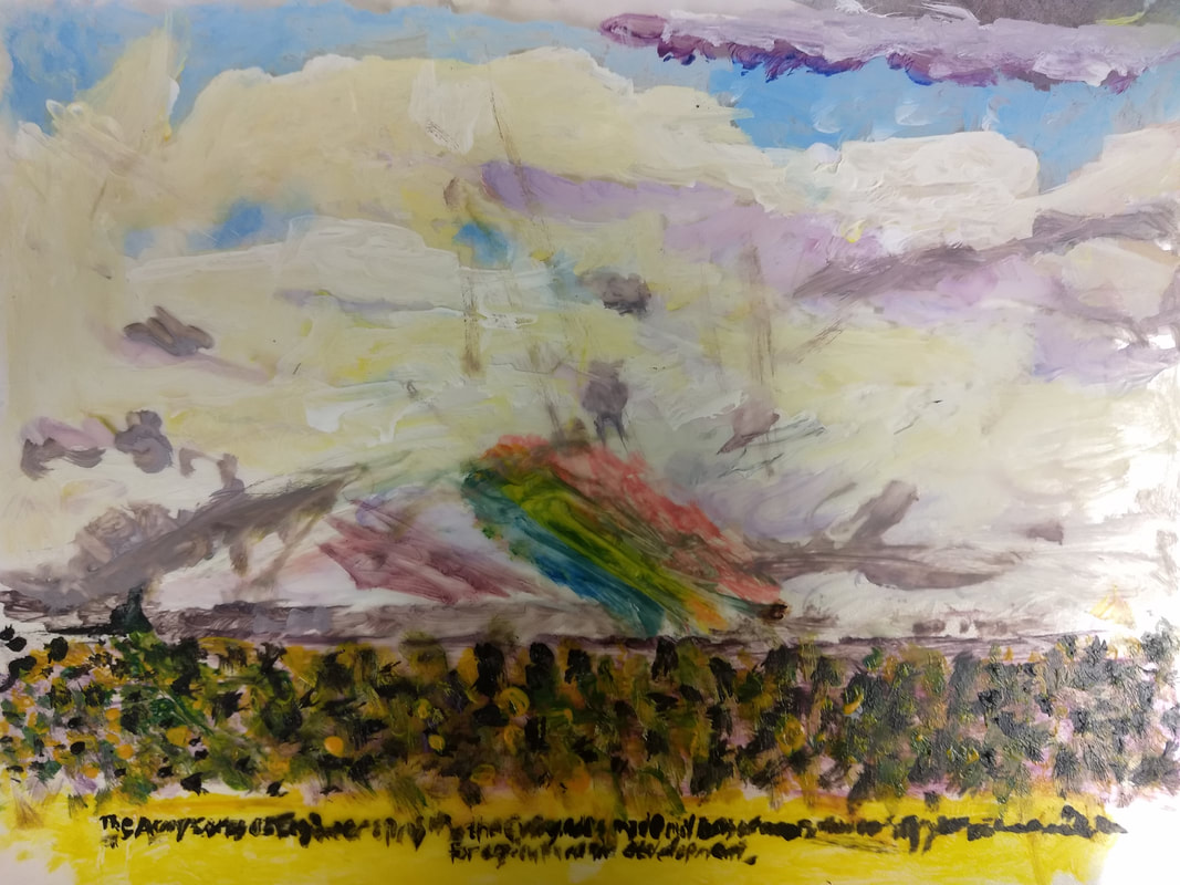
Paul Saari is a Canadian oil painter that uses pastel tones to crate a mystical effect on his art. He went to Lakehead University and got a honors degree. He likes to have his pictures based on mythical images, an unreal set of real animals particularly butterflies. The images generally deal with nature or the environment. His recent set of paintings is man's relationship with nature. He portrays the mystical things in a swirl bunched up together. He has an Instagram page along with a website to show off his work. His works are in various galleries in Canada, or online.
What makes Saari's work inspiring to me is his skill to paint perfectly without reference. He has to go and make images up himself, showing creativity and skill. His elaborate art drew me to choose him, he stood out from the others while browsing through the website. His paintings feel so alive, something I want my art to feel like. I notice he can add a lot of color and detail to small spots demonstrating to me he is a skilled artist. He can create such great art with the pastel tones. He wasn't born with this talent, he had to work to accomplish his level of skill. Website: http://www.paulsaari.com/ |
Pastel Tones
|
|
|
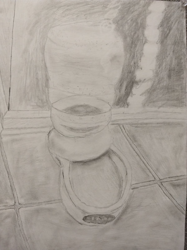
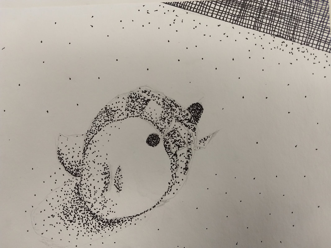
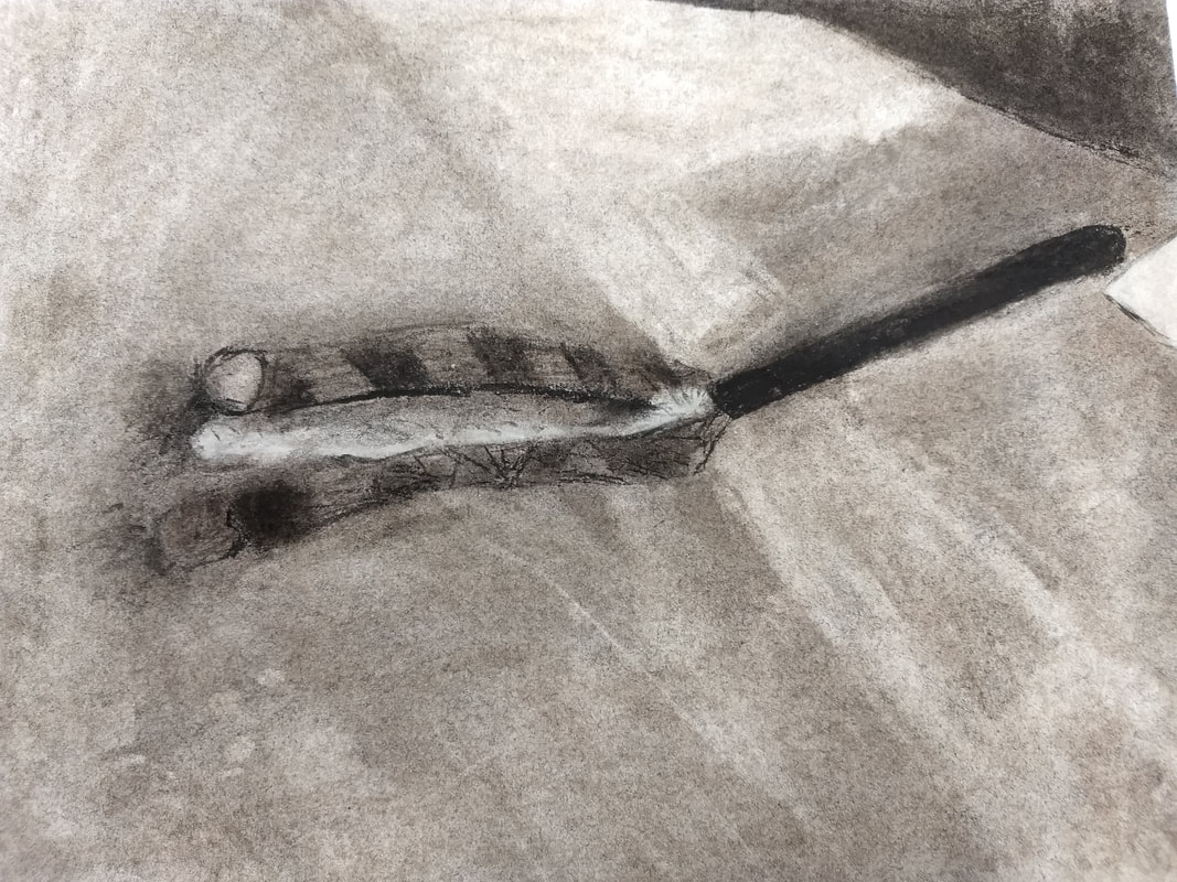
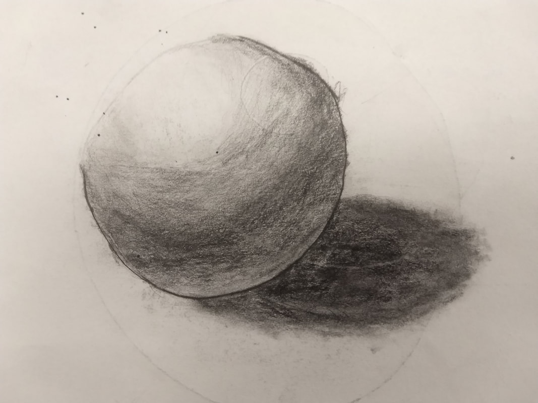
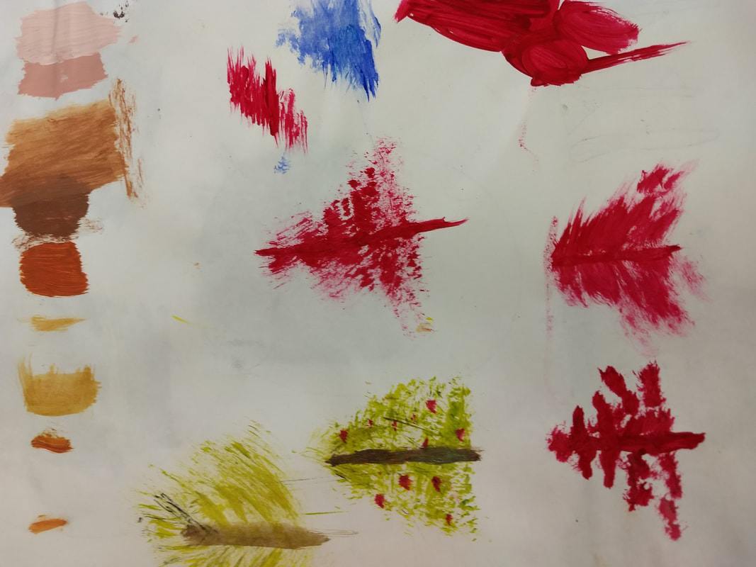
Drawing Project
|
The most helpful warm up was the sphere. I needed this for my pencil drawing, as it was a cylinder. I learned how to make shadows using this warm up.
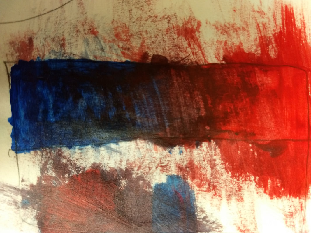
Composition is the arrangement of visual elements in a work of art. Value is how light or dark something is. Pen Pros: You can get darks easily Pen Cons: You can't erase Pencil Pros: You can erase and get great shading Pencil Cons: Darks are harder to get Charcoal Pros: You can blend out mistakes Charcoal Cons: It's hard to get sharp edges |
|
|
|
|
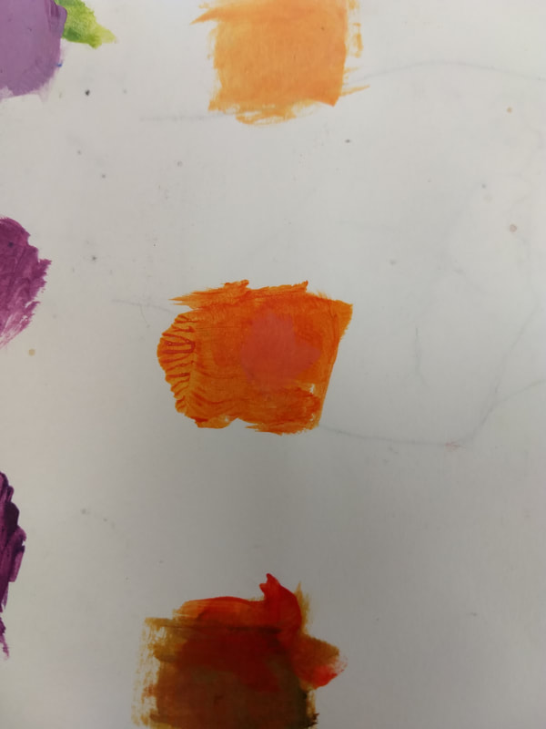
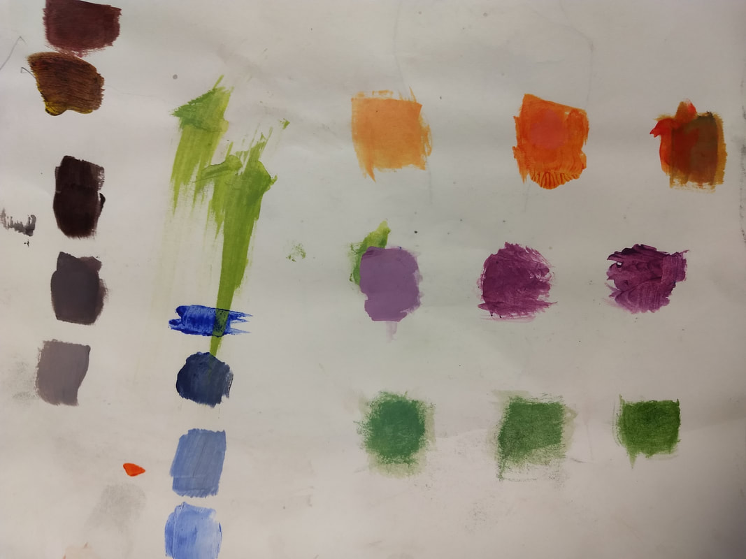
Color/Paint mixing
|
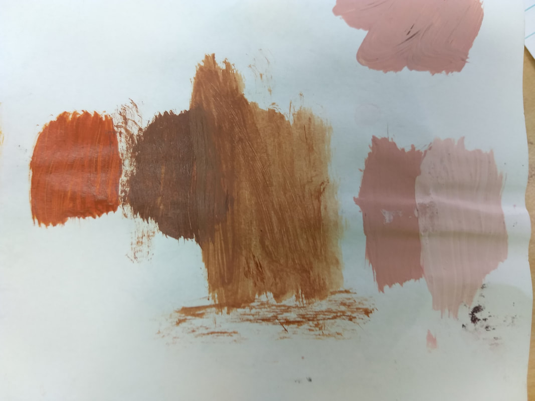
I learned how to mix paint to crate certain colors and shades in the is warm up. I also learned how to make brown witch is important for my trees.
You make brown by mixing complementary colors together, such as green and red. |
|
|
|
The Idea of Place
|
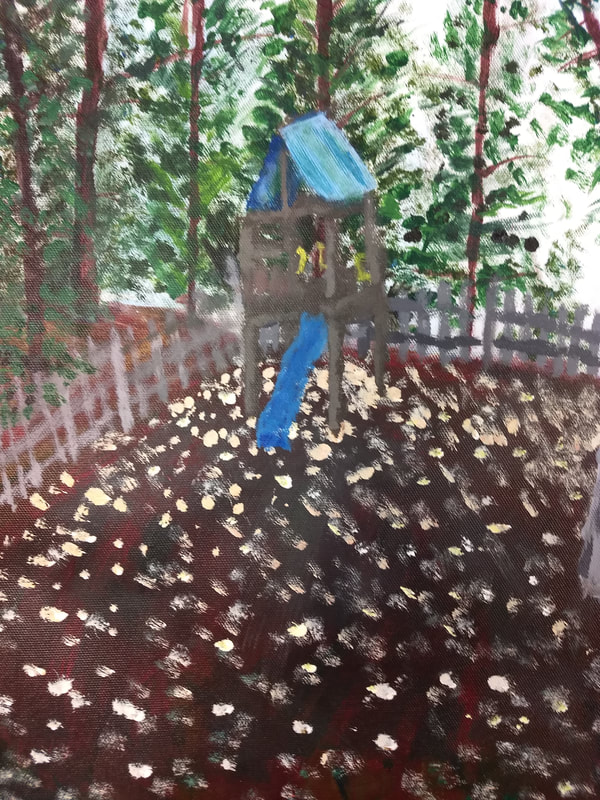
The place is my backyard, an important place where I go everyday.
I found the little house and trees to be the most challenging part. I had to be very precise here and it was hard matching the blue. I think my most successful part was the trees as they looked good and the values matched up. I started from the back and moved forward. First I toned it with a watery red, than added the sky, tees, fence, ground, and last the little house. |
|
|
|
|
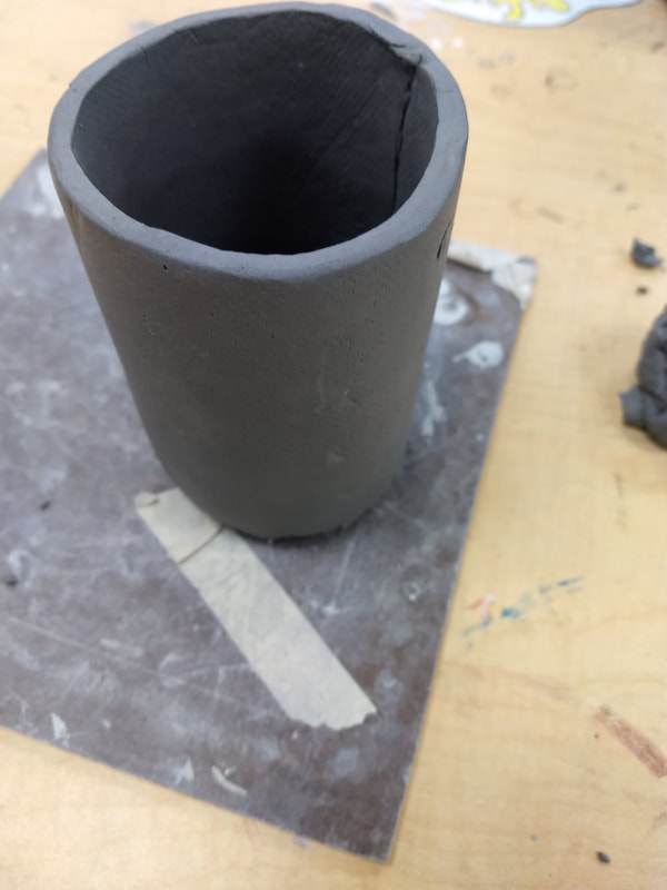
In Process Blog Vessel
|
1. I plan to add a lid at this stage and smooth it out. The lid will have the handle. Once finished with killing i'll add the coke label.
2. I found making the cylinder connect with scoring and slipping rather difficult. It was hard making the perfect cylinder, an mine was a little imperfect, but it worked. 3. I find the bottom successful. It gives it the shape of a can. 4. I started by making a slab, making it square and wrapping it in a cylinder. I scratched (scored) and slipped pieces together so they won't break in the kiln when fired. Once fired as a bisquare i will put the glaze to make it a glazeware on the second fire. |
|
